Showing posts with label challenge. Show all posts

Jul 21, 2012

Water Fun

(English below)

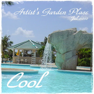
久しぶりにAGPに参加です。#24 - blue / cool


Supplies:
cardstock - Core'dinations
patterned paper - Pink Paislee, Prima Marketing, My Mind's Eye, 7gypsies, Sassafras Lass
vellum - Webster's Pages
Chipboard - Pink Paislee
brad - Sassafras Lass
mist - Tattered Angels

娘が水遊びをする様子です。
結構早い段階でできていたのですが、公開するタイミングを逸しており今に至ります。

AGPというかChallengeそのものにも久々の参加のような気がします。最近仕事が予想外に忙しく、DTワークだけでいっぱいいっぱいでした。

2FrolleinのBlog Hopにお誘いいただいたときも「忙しすぎて無理~!」というのが本音でした。2fでなかったら断っていたと思います。メンバーが豪華すぎて断るわけにはいかないと奮起しましたが…。

仕事が忙しいのはmillion momentsのせいです。今月中に50万DLいくかも。まだ成長過程ですがすごくいいアプリなので応援よろしくお願いします!

Here is my layout for Artists' Garden Place challenge #24.
The color for this challenge is "blue" and the word is "cool", so I made a layout with pictures in which my daughter enjoys water in a paddling pool.

I was happy to be able to join this challenge.

Feb 20, 2012

beauty - PMB #16

3 DT layouts are enough to keep me busy, but this month I made the 4th layout for Pages of My Book #16.
They have Rahel Menig as a guest designer this month - Rahel's creations are so inspiring and I'm addicted to her style. So I thought I must be in!

And here is my take:

Supplies:
cardstock - core'dinations
patterned paper - Prima Marketing, Pink Paislee, 7gypsies, My Mind's Eye, Webster's Pages
chipboard - Jenni Bowlin, Pink Paislee
sticker - Prima Marketing
glitter - Martha Stuart
twine - My Mind's Eye
other - paper doily, vellum, badge, tulle, resin flower

Close-up:


For the banner part, I curved a stamp by myself. See this post for a bit more about this stamp.

The title is "beauty is in the heart of the beholder" - whenever I see my daughter, this phrase comes up to my mind. She might not be beautiful for other people, but for me she's absolutely beautiful, especially when she shows me such beautiful (and sometimes funny) smile.


I love their inspiration board as always:


毎月3つのDTワークって、会社員な私には結構きついんですが、今月はPMBのゲストデザイナーがRahelとあって、4つめのLOをつくり頑張って参加してみました。
Rahel好きなんです。どれぐらいかって、ブログのサイドバーから彼女のブログにリンクを貼ってしまうぐらいに。

タイトルのバナー部分は消しゴムはんこを自分でつくりました。
あ、このタイトル。どうしても娘の写真を使いたかったんですが、あいにくBeautyとは対極に位置するようなひょうきん者なので、苦肉の策…「美は見る人の心に」。
いや本当に、かわいいと思うんです。親の目線から見ると。いいタイトルだと思います(笑)

インスピレーションからはインクのスプラッター(ちょっと失敗)とバナーをいただきました。
色も、黒+青緑だと思ったんですが、結果としてLOのほうは青緑というより水色っぽくなり、全然違う雰囲気になってしまいました。

Jan 29, 2012

New friend

(English below)

Artist's garden placeのchallenge #18に参加します。最近他を含めてなかなかチャレンジに参加できず、久しぶりです。

テーマはこちら。
word: New
color: Yellow

LOはこちら。


Supplies:
cardstock - core'dinations
patterned paper - Pink Paislee, Glitz, Cosmo Cricket, BasicGrey, K & Co., Making Memories, 7gypsies
sticker - American Crafts
rub-on - Jenni Bowlin
brad - Sassafras Lass
ticket, game piece - Tim Holtz
other - paper doily, baker's twine, vintage book-page

ペーパーを折りたたんで中に写真を貼るのは、「ハッピーフォトグッズ」という本に載っていたエミーさんのレイアウトからヒントをいただいています。随分前に買った本ですが、久しぶりに引っ張り出してみると新たな発見があるものです。

自分のスタイルはsimple & messy(またの名を手抜き)だと思っている私ですが、今回ちょっとsimple & cleanを目指してみました。
白背景にすればどうにかなるかと思ったんですが、うーん。私やっぱりもうちょっとごちゃごちゃさせたくなってしまいます。
ちなみに、白背景に白いエレメントっていいなーとこのLOを作っていて思ったのですが、白い星見えますか?newの文字は見えると思いますが…

Here is my take on AGP challenge #18.
My son and his new stuffed toy, Harry - it's a hedgehog and we named it after "hari" (Japanese word means needle). He loves it so much and gives it many hugs and kisses.

In this layout I folded the photo mat and put another photo inside it. This idea came from a Japanese book "Happy photo goods", which I bought some years ago.

I think my style is "simple & messy", but this time I tried to make my layout "simple and clean". I used white for background and I thought it would make the layout look clean, but hmm...

Nov 1, 2011

Boys festival - Polkadot Door blog hop

It's time for the Polkadot Door Designs blog hop + inspiration challenge.
I'm excited to be invited as a guest designer again!


Really inspirational color combo...
This is what I created:


Supplies:
patterned paper - My Mind's Eye, BasicGrey, Sassafras Lass, Cosmo Cicket, Prima Marketing, Webster's Pages
alphabet sticker - Prima Marketing
sticker - Sassafras Lass
chipboard - My Mind's Eye, Sassafras Lass, Prima Marketing
transparency - Hambly Studios
button - Jenni Bowlin
trim - BasicGrey
twine - My Mind's Eye
other - paper doily, magic mesh, cotton fabric

It's my son's first Boy's Festival (Tango no Sekku - Japanese traditional festival for boys on May 5; we display warrior-dolls to express the hope that boy(s) in the family will grow up healthy and strong).


Here is the list of blogs in this month's blog hop:
Aki  --> you are here
Nita

Be sure to vote for your favorite designer at the end.

sponsors:
Scrap Eco Chic, who will be providing the prize for the Challenge winner which is a $10 Gift Certificate to their Etsy shop.
Abbey and Ellie is giving away a prize package of their gorgeous items to the bloghop winner. 
Hydrangehippo is providing a HUGE give-away for the featured designer of $50 to their etsy shop! This Etsy shop has lots of fun scrapbooking embellishments and kits, so make sure you encourage your readers to stop by the Polkadot Door Blog to leave a comment voting for your project!

今月も、Polka Dot DoorのGDTにお招きいただきました。

チャレンジもブログホップも素敵な賞品もありますので、ぜひご参加ください。

ブログホップに参加される際は、最後にPolkadot Doorのブログでお気に入りのデザイナーをコメントに記入してください。

今回のインスピレーションは色使いがとても印象的でした。一応、同じ系統の色を使ってみた…つもりです。(あとタグと。)

写真は息子の初節句です。
インスピレーションは季節的にも感謝祭っぽいなぁと思いつつも、日本人なので感謝祭には無縁だし…と悩んだ結果、祭つながりで、成長に感謝できて、何となく写真の中に今回のインスピレーションと合いそうな色があったという初節句を選びました。季節はずれですね。

Sep 28, 2011

lunch time

(English below)

なかなか作品が作れずにいた今月ですが、AGP Challenge #14に参加します。

私の作品:

Supplies:
patterned paper - Fancy Pants, BasicGrey, My Mind's Eye, Prima Marketing, Webster's Pages, 7gypsies
flower - 7gypsies
brad - BasicGrey
journaling card - Jenni Bowlin
other - vintage sewing pattern, vintage bookpage, postage stamp, paper doilies, cotton fabric, ticket, flowers, magic mesh


ワード&カラー:
Word: time
Color: brown

ワードから、タイトル"lunch time"、カラーはもう、これでもかというぐらい茶色を使ったつもりです。

娘が息子に食事をさせている写真です。
娘のほうが大きい口をあけているような気がしますが…

久々にPPを大量消費したような気になっていましたが、後からよく見ると、いろいろ重なってはいるものの、PP以外のものも多いですね。
私としては、ずっと眠っていた7Gのベルベットフラワーが使えて大満足なのですが。
多分これ3年ぐらい眠っていました。

Here is my take on Artist's Garden Place challenge #14.

The title is "lunch time", which came from this challenge's word "time".
My daughter feeds her brother, with her mouth widely opened! I like seeing her feed him. It's one of the easiest way to feel so happy.

Aug 25, 2011

don't follow your dreams,

Here is my take on Polkadot Door inspiration challenge:


Supplies:
patterned paper - My Mind's Eye, BasicGrey, Sassafras Lass
flower - BasicGrey, Prima Marketing
trim - BasicGrey
alphabet sticker - Prima Marketing
other - dymo

Here is the inspiration:

I chose pink and orange as main colors, based on the photo. I placed photo and paper pieces like frames in the inspiration.
Also, I used felt alphabets, just because the inspiration board has felties on the bottom right.

I like this sentiment, "don't follow your dreams; chase them". I really would like to say this to my children.

Polkadot Doorのチャレンジに参加します。
インスピレーションから、ピンクとオレンジの色を選びました。また、写真と四角に切ったPPをフレームのようなイメージで配置しました。

このタイトル、とても気に入っています。本当に、子供たちにはこんなことを言いたいです。

Jul 25, 2011

tell me your story

(English below)

Pages of My Book chapter / 09 - STORYに参加します。


私の作品はこちら。


supplies:
patterned paper - Sassafras Lass
sticker, tag - Making Memories
ribbon, ticket, fragment - Tim Holtz
flower - Prima Marketing
chipboard - K & Co.
other - kraft cardstock, die-cut, hemp twine, postage stamp, lace, button, glassine paper

娘の保育園での様子です。
保育園の先生がこういう写真を撮影してくれます。

大人には信じられないようなスピードで成長していくのに、私は昼間ほとんど娘を見ていないんですよね・・・
一応、写真には残るんだけど、本人の口からもいろいろ聞きたい、そんな気持ちを込めてのタイトル"tell me your story"です。

インスピレーションボードをスケッチとして使っています。あと、エアメールのイメージから切手やタグなど郵便グッズを使っています。

ちょっと透け感のあるイメージだったので、タイトルはグラシン紙でつくった袋に入れています。
ヴィンテージの小物と一緒に。

Here is my take on Pages of My Book chapter / 09.

The title is "tell me your story" - I don't know what my daughter does while she is at her nursery school, and I wish if she could tell me her story. (When I ask her, she always says "Today I played with girls! That's all!")
Her teachers sometimes take pictures, like ones on the layout above, and these pics help me feel how she is growing up.

I used the inspiration board as a sketch.
The title is in a bag made of glassine paper.

Jun 2, 2011

sweet memories of spring


Here is my take on the color room #60:

I used a kit which I got from my swap partner, mochico.


I love this beautiful kit :)
It's really nice for spring layout. Spring is my favorite season - I love cherry blossoms, and they reminds me of the day my daughter was born (she was born in April and I named her after cherry blossoms).


プリマンカイ祭11弾・mochicoさんのキットでTCR #60のLOをつくりました。
素敵なキットでしたが、普段こういうのをあまり使わないのでかなり悩みました。結局、キットのエレガント路線を突っ走るべくプリマのPPを足して完成させました。

春のLOにぴったりのキットでした。
作るのが私で非常に申し訳ないですが、きれいだしかわいいし、このキット好きです。

でもよく考えたら、春に撮った写真はあっても春らしい写真はあまりなく…
春といえば、桜。そして、娘の誕生日。ということで、娘の生まれたての写真と、その年の桜の写真を使いました。

May 24, 2011

Life is beautiful banner

Pages of My Book chapter / 07とArtist's Garden Place #10にチャレンジしました。

PMBのテーマがLife


AGPのテーマがLife is beautiful

なので2つを兼ねてみました。しかもLOじゃなく、まさかのバナーで!

PMBのインスピレーションボードからは色使いとトランスパレンシーを。
AGPからはタイトルをそのままと、beautifulの赤を。

時期的にいろいろ考えさせられるテーマではありましたが、なにげない日常生活というのが本当は一番美しいのではないかと思う今日この頃です。

Close-ups:
 

supplies:
sticker - BasicGrey, Prima Marketing, Sassafras Lass
chipboard - Maya Road, K & Co., Jenni Bowlin
die-cut - 7gypsies
flower - Prima Marketing
journaling card - Webster's Pages
transparency - Hambly Studios, Little Yellow Bicycle
lace trim - Prima Marketing
brad - BasicGrey
other - corrugated board, liquid pearl, sewing pattern, hemp twine, metal charm

Here is my take on Pages of my Book / Artist's Garden Place.
From PMB I got the inspiration of using transparencies. The colors were also inspiring.
From AGP I got the title, and red color for "beautiful". 

May 11, 2011

Hinamatsuri

Here is my take on Let's get shabby challenge #23.


The challenge is
1. use these colors
2. must use spots of some kind

Hinamatsuri, doll festival in Japan, is celebrated on March 3. It is also called Girls' day. We put dolls on display and wish happiness of girls.

This time I tried paper piecing. It was fun, but when I'm finished with cutting I realized that my fingers are sooo tired!

I used liquid pearls as spots.

supplies:
paper - Webster's Pages, Prima Marketing, My Mind's Eye, BasicGrey
flower, pearl, alphabet sticker - Prima Marketing
other - paper doily, liquid pearl

Close-ups:


Let's get shabby #23です。
ガーリーな色!ということで、ひなまつりの写真を使いました。
PPをはさみでカットしてみたのですが、楽しい!そして…終わった後は指が何か変(笑)

ちょっといつもとテイストが違う作品になりましたが、多分こういうのはもう作らないと思います。合う写真がないので(笑)

Apr 24, 2011

two to love

This is a layout I made today. I used black paper - the color I seldom use as a main color in my works. Isn't it chic?


Sketch is from Once Upon A ...Sketch (April 15th challenge),


and inspiration is from Pages of My Book (chapter / 06 - LOVE).

This inspiration board shows why I used kraft background - I didn't have wood grain paper or any other brown paper, and the most wood-like color I had in my stash was kraft. I realized I have to go shopping again!

珍しく黒をメインに使ってLOをつくりました。スケッチはOnce Upon A ...Sketchから、インスピレーションはPages of My Bookからいただきました。

PMBのインスピレーションボードから、色使いのヒントをいただいています。木目はおろか茶色のPPも無く苦し紛れのクラフトだし(買い物にいかねば!)、ピンク完全無視ですが、木目+白に黒が効いてるなーと思って…。

ピンクは完全無視ですが。ピンクは。(本業でピンク使って疲れたのです。ピンクはニガテだと認識したのです。)

Apr 12, 2011

mom's little helper

It has passed a month since the earthquake and tsunami had occurred. We had some earthquakes today, and two of them were relatively big. I don't know how many earthquakes we had since 3.11 - I guess it's more than 100.

People outside Japan seem to worry about the nuclear power plant, but what scares me the most is still an earthquake.

Well, here is my take on GYSO #14.

I used Cosmo Cricket + Sassafras Lass paper from my stash.
And I enjoyed stitching so much.


Here is the sketch:

震災から1ヶ月、今日もまた比較的大きな余震があって、本当にいつまで続くのか不安になります。海外では原発の問題に関心が高いようですが、目に見えない放射能よりも私は地震がこわいです。

GYSO #14にチャレンジしました。たまっていたCosmo CricketとSassafras Lassのペーパーを使っています。
ステッチをがーーーっとするのをとても楽しめました(笑)

Apr 7, 2011

2 - Pencil Lines #232

I did a layout based on Pencil Lines sketch #232.

My daughter's 2nd birthday. But she will be 3 this month!


Here is the sketch:


Pencil Linesの#232でLOをつくりました。娘の2歳の誕生日の写真なんですが、恐ろしいことに今月3歳の誕生日がやってきてしまいます。

Mar 12, 2011

Color Combos Galore #183

Color Combos Galore #183


I love this color combo! Just see my blog header, lol.
And here is my layout "Baby acne".


We had earthquakes in Japan today. When the first huge one occurred, I was thinking about this layout.
What the sketch should be, which photos to use - thinking about my layout is such a happy moment, but suddenly the moment was gone. I was so frightened. The first one was so long, it last more than 3 minutes. I was with my son, the only good thing was that he was smiling.

We had a very busy day today, with several after-quakes. My sister couldn't go back home and walked to our home from her workplace.
It's 2 A.M. but my husband is still at his office.

I decided to complete this layout today, maybe I needed something to remember today.

CCG#183を考えているときに今日の地震に遭遇しました。妹は家に帰れず私のところまで歩いてきました。夫はまだ帰りません。
本当にいそがしい一日でしたが、このレイアウトを完成させることにしました。今日という日を記憶したかったのかもしれません。

Jan 24, 2011

DELIGHT - PMB chapter / 04

Pages of My Bookに今月も参加します。
どうでもいいことなんですが、職業柄、「PMB」と言われるとカムコーダーのバンドルアプリを先に連想してしまいます。

DELIGHT

ふ、複数形でもいいよね??

ディズニーシーでの出来事。
アトラクションに乗ったりチップと手をつないで歩いたりしましたが、結局のところ、一番のお気に入りはポップコーンで、その喜びっぷりは尋常じゃなかった。という様子をLOにしてみました。

左下の写真は安直すぎる気もしますが、マップをインクでディストレスしたり、クラフトのペーパーを使ってみたり、全体的に、インスピレーションボードの写真に影響を受けて、「ちょっとノスタルジックなポップ」を目指してみました。目指しただけ…

Cosmoのエレメンツはポップアップさせています。


Here is my take on Pages of My Book chapter / 04 - DELIGHT.

"popcorn always gives me delights" - when we went to Tokyo Disney Sea, my daughter dangled the popcorn bucket from her neck and never let us have it. She ate a lot, smiled a lot, and her smile gave us a lot of delights.
And popcorn obviously gave her delights!

Dec 21, 2010

dream - pages of my book chapter/ 03

Pages of My Bookに初参加です。


私の作品は、題して、「夢を描くノート」!
表紙はこんな感じです。蜜蝋でロウ引きをしたり、アクリルで色を塗ってみたり。いつもの作品より、少し時間をかけてみました。


じ、じつは…
BIAで穴を開けてから、ワイヤはどこじゃー!?と慌て、苦肉の策でレースで結びました。
ブロンズのワイヤと合うと思ったのになぁ…

表紙と裏表紙の内側は、ロウ引きをした紙をどーんとメインに使っています。これだけでもう、余分なエンベリッシュメント不要になりました。

中身は真っ白です。敢えて、無漂白などのナチュラルな色ではなく、不似合いな白上質紙を選びました。真っ白を強調したくて…


今はまっさらなこのノートに、やりたいことを書いていって、このノートが夢でいっぱいになればいいなぁ、と思います。

本当は最初、こんなんだったんです↓


お花の写真からインスピレーションを受けた部分なだけに躊躇しましたが、ちょうちょがちょっとくどい気がして、思い切って外しました。
私はちょうちょナシのほうが私っぽくていいかなーと思っています。
あ、一応、切手の色もお花の色に合わせてセレクトしたんですけどね。

Here is my take on Pages of My Book chapter / 03.
I made a mini notepad for the chapter of "dream".

Which is better, with or without butterflies?
I like the "without" version :)